A weekly Macro, Cross Asset review of prices trading at extremes which may generate future investment ideas and opportunities.
The following assets (on a weekly timeframe) either registered an Overbought or Oversold reading and/or have traded more than 2.5 standard deviations above or below its rolling mean.
* denotes multiple week inclusion
Extremes above the Mean (at least 2.5 standard deviations)
Japanese 5 year bond yields
Cocoa
Coffee
Lumber *
Dutch TTF Gas
CAD/EUR
USD/DKK
USD/SEK
Dow Jones Transports *
S&P SmallCap 600 *
Russell 2000 *
S&P MidCap 400 *
Overbought (RSI > 70)
U.S. 5 year minus U.S. 3 month yield spread
U.S. 5 year minus U.S. inflation rate
U.S. 10 year minus U.S. inflation rate
Pakistan’s KSE *
Czechia’s PX Index *
Toronto’s TSX
Australian Financials Index
The Overbought Quinella (Both Overbought and Traded at > 2.5 standard deviations above the weekly mean)
Japanese 2 year bond yields
KBW Bank Index *
KRE Regional Banks Index *
Hungary’s BUX Index *
Israel’s TA35 *
Extremes below the Mean (at least 2.5 standard deviations)
Tin
COP/USD
EUR/USD
Austria’s ATX Index
Denmark’s Copenhagen OMX 25 *
FTSE 100
Oversold (RSI < 30)
U.S. 3 month government bill yield *
Australian Coking Coal *
U.S. Midwest Hot Rolled Coil Steel *
North European Hot Rolled Coil Steel *
Lithium Carbonate *
Lithium Hydroxide *
The Oversold Quinella (Both Oversold and Traded at < 2.5 standard deviations below the weekly mean)
RMB/USD *
Notes & Ideas:
Global government bond yields were mixed.
American, Australian and Asian yields rose, resuming their recent climb, while European yields fell.
Last week’s overbought entrants are no longer so.
US10Y – AU10Y spread isn’t oversold.
Chilean and U.S. 2 year yield has risen for 4 straight weeks, with the latter rising for 6 of the past 7 weeks.
U.S. 10 year minus Euro 10 year bond yield spread has climbed for 8 of the past 9 weeks.
The U.S. 2’s are their highest weekly close in 4 months,
And the yield for the U.S. 10’s and 30’s are at their highest since late May 2024.
Equities fell.
Financials were the exception.
Chinese, Semiconductor and MidCap indices were amongst the largest losers.
The former are still likely to ‘back and fill’ recent gaps.
Indonesia’s IDX, Philippines PSI, Denmark’s OMX25 and Switzerland’s SMI have fallen for 4 straight weeks.
The latter has sunk 6% over the past 4 weeks.
The Dutch AEX is in a 5 week losing streak.
Helsinki has fallen for 6 of the past 7 weeks.
Inversely, the Tel Aviv35 Index and Czechia’s PX have respectively risen for 5 and 6 weeks.
The KOSPI is near an oversold extreme,
And the Nasdaq Biotech Index dramatically mean reverted (tanking 10%) influenced by the potential policies and positions taken or held by the incoming Health secretariat appointment of Robert F Kennedy Jr.
Commodity prices were mostly weaker, according to the broader indices.
Under the covers, Cocoa, Coffee, Gas, Uranium and Baltic Dry Index rose strongly.
On the downside, Oil, Cotton, Platinum, Gold, Silver, Wheat, Palladium, Copper and Tin were amongst the notable decliners.
The Baltic Dry Index has soared 28% in 2 weeks.
Copper is nearing its lowest close since March 2024.
Palladium has slumped 23% in 3 weeks.
Gold in USD and Platinum have fallen 7% and 9% respectively over the same time.
The DXY hasn’t declined for 7 weeks.
Gold isn’t overbought anymore nor are Lean Hogs.
Rice bounced out from oversold and broke its 7 week losing streak.
JKM LNG could new a new long prospect
And Sugar is in a 6 week losing streak.
U.S.Midwest Hot Rolled Coil Steel has spent 25 weeks being oversold,
And Lithium Hydroxide has now lingered in weekly oversold territory for 70 consecutive weeks.
Currencies were active again.
Several pairs are appearing in thus weeks list.
The DXY Index is at its highest close in 12 month and is in a 7 week rising streak.
AUD was weaker against all except for the GBP.
AUD/USD has sunk for 6 of the past 7 weeks.
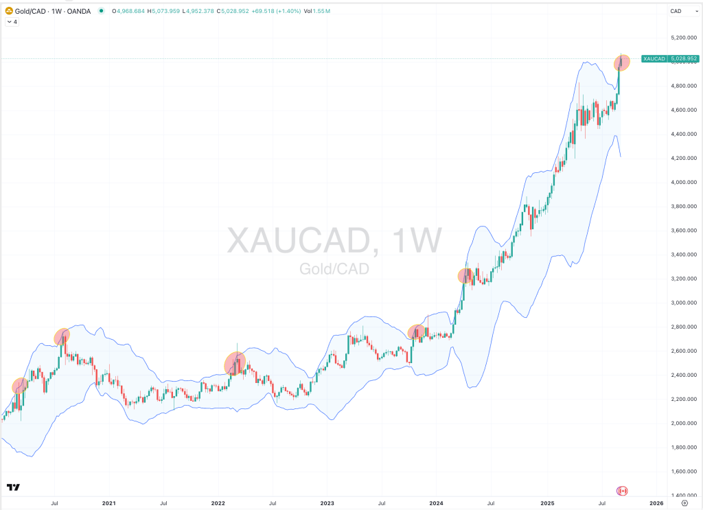
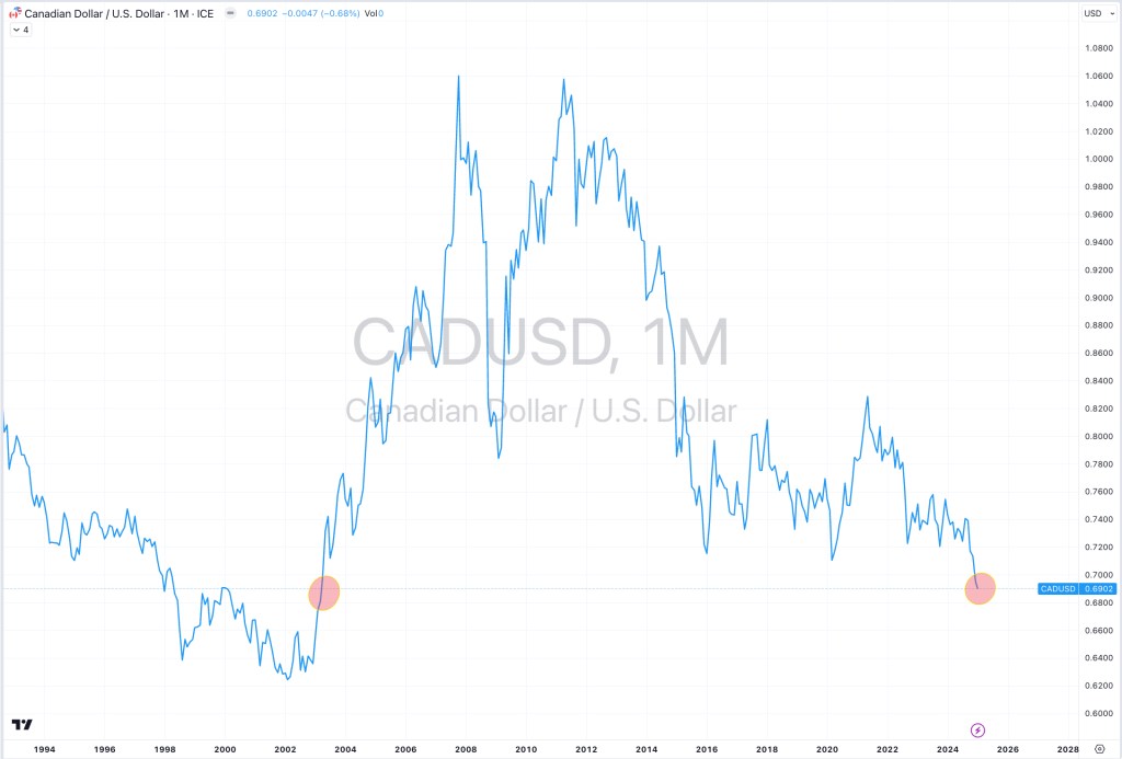
The Loonie rose everywhere except versus the USD.
The CAD/USD is also closing in on an extreme reading.
And both the GBP/USD and MYR/USD are in 7 week declining streaks.
The larger advancers over the past week comprised of;
Rotterdam Coal 2.6%, Baltic Dry Index 19.4%, Cocoa 22.2%, DXY 1.8%, Arabic Coffee 12.8%, Lumber 1.9%, JKM LNG in Yen 5.5%, Lithium Carbonate 1.5%, Natural Gas 5.8%, Orange Juice 3.5%, Robusta Coffee 9.1%, Dutch TTF Gas 9.8%, Uranium 8%, Rice 4.7%, KBW Bank Index 2.3%, Budapest 2%, Oslo 2%, Tel Aviv 1.7%, BIST 2.2% and the ASX Financials rose 2.1%.
The group of largest decliners from the week included;
Australian Coking Coal (1.5%), Bloomberg Commodity Index (2.1%), Brent Crude Oil (4.2%), WTI Crude Oil (4.8%), Cotton (5.8%), Copper (5.6%), Heating Oil (2.9%), Lithium Hydroxide (7.1%), Tin (9.2%), Nickel (5.5%), Palladium (4.9%), Platinum (3.4%), Gasoline (3.1%), S&P GSCI (2.1%), Silver in AUD (1.6%), Silver in AUD (3.4%), Gold in AUD (2.7%), Gold in CAD (3.3%), Gold in CHF (3.1%), Gold in EUR (2.9%), Gold in USD (4.5%), Corn (1.6%), Soybeans (3.1%), Wheat (6.2%), Shanghai (3.5%), CSI 300 (3.3%), All World Developed ex USA (2.6%), DJ Industrials (1.3%), CAC (1%), HSCEI (6.5%), Hang Seng (6.3%), Jakarta (1.8%), S&P SmallCap 600 (3%), Russell 2000 (4%), TAEIX (3.4%), Nasdaq Composite (3.2%), KLSE (1.8%), KOSPI (5.6%), S&P MidCap 400 (2.7%), Mexico (2.7%), Nasdaq Biotech (10.2%), Nasdaq 100 (3.2%), Nikkei 225 (2.2%), Nifty (2.6%), Copenhagen (2.2%), Stockholm (1.9%), PSI (4.3%), Sensex (2.4%), SMI (1.5%), SOX (8.6%), S&P 500 (2.1%), Nasdaq Transports (2%), Vietnam (2.7%), WIG (3.6%), ASX Materials (5.6%) and the ASX Small Caps fell 1.5%.
November 17, 2024
By Rob Zdravevski
rob@karriasset.com.au


