More about the Copper/Gold Ratio
May 2, 2021 Leave a comment
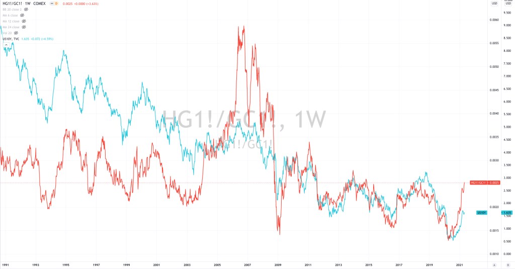
In an earlier post covering the Copper/Gold Ratio, I mentioned how the ratio is helpful in taking the ‘temperature’ of the economy but it is most correlated to the U.S. Government 10 Year Bond Yield, as the chart below shows.
In the chart below, the Copper/Gold Ratio is represented by the red line.
A sharp rise in this ratio is often driven by outsized price rises in copper when compared to the gold price, which is the case presently.
It’s difficult to discern who leads who but I can tell you that the Copper/Gold Ratio and the 10 Year Bond Yield are both Overbought on a longer term weekly basis’.
May 2, 2021
by Rob Zdravevski
rob@karriasset.com
