Health Check – the Copper/Gold Ratio
May 2, 2021 Leave a comment
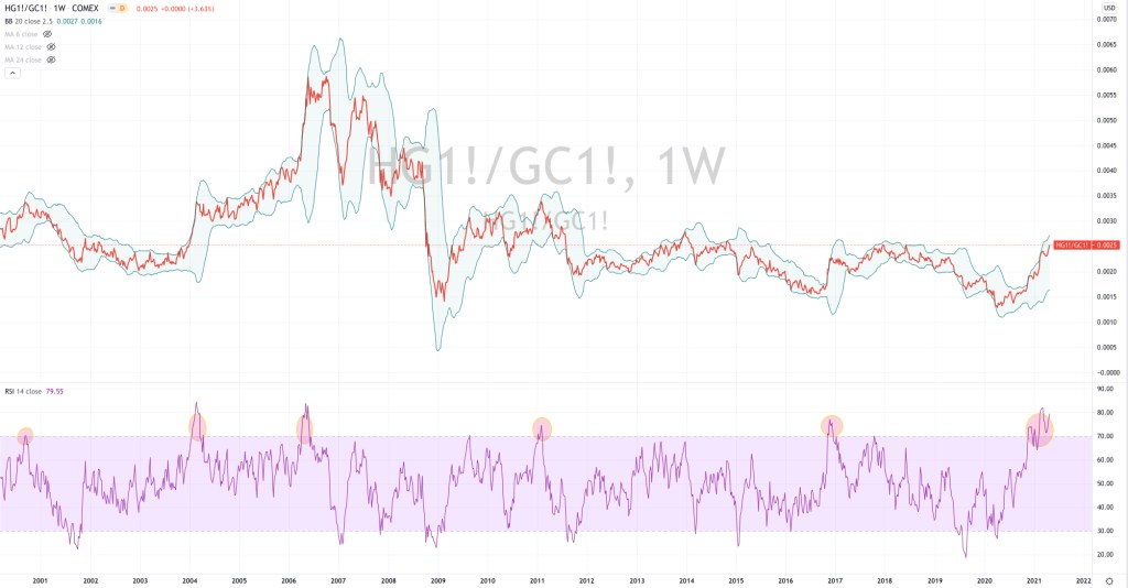
The watching the direction (not necessarily its value) of the Copper/Gold Ratio helps me reading the health of the economy.
And it has been healthy….
It’s particularly correlated with the direction of the U.S. Government 10 Year Bond Yield. More on that in the next post.
The chart below shows us the 6 moments when the Copper/Gold Ratio has registered an Overbought reading over the past 20 years.
Such occurrences correlate to and increase the probability of lower prices in the S&P 500 Index or at the very least see it trade sideways for the coming months. This also coincides with my thesis in my recent newsletter.
https://mailchi.mp/karriasset/quadrupling-yields-increases-equities-risk-2
What this chart tells you is that probability does not suggest ‘going long’ or making any meaningful capital deployment into equities at this juncture.
May 2, 2021
by Rob Zdravevski
rob@karriasset.com.au
