Predicting interest rates with the Copper/Gold Ratio

Interest Rates at the longer end of the curve may be poised to rise.

I think many concur (mainly through central bank guidance) that shorter term rates will stay lower, for longer.

In the interim, I may have views that 10 & 20 year debt at the consumer levels may become cheaper (perhaps 2.8% for mortgages);

however my interest in the Gold/Copper ratio has less to do with predicting price action in those underlying commodities, but more so with the direction of U.S. government bond yields.

I think it is plausible that short term rates stay low but I think longer dated bonds will rise.

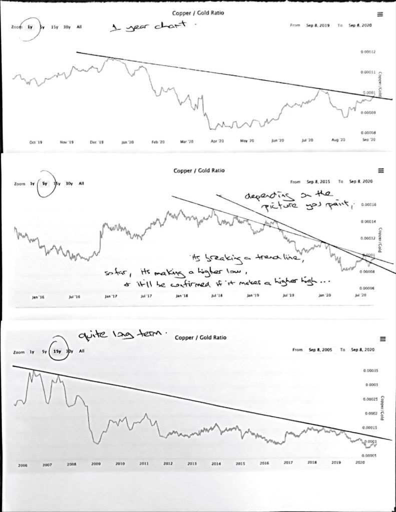
Take a look at my printed, line drawing, stacking different time line (1yr, 5yr & 15yr) charts on top of each other, old school effort below…..

FYI, today, the U.S. 10 year government bond is yielding 0.70%.

September 10, 2020
by Rob Zdravevski
rob@karriasset.com.au

JGB’s leading the way

Yield in Japanese Government 10 year Bonds (JGB) are moving lower today, falling from 0.03% to 0.022%.

This is a big move!

What’s more significant is they look set to move below 0.00% and into a negative yield as a new “short-term” downtrend seems to be developing.

A little correlation to watch is what looks like a leading indicator.

The JGB’s are preceding a move in the S&P 500 AND a most notable historical observation was the JGB downtrend which started in mid-January 2020 signalling an early peak in the S&P 500.

The downward pressure on the S&P 500 seems to have increased especially when the JGB yield went negative.

For now, let’s watch it if it moves below zero again.

In the chart below, the blue line is the JGB yield (right hand margin) and S&P 500 appears (legend in the left hand margin) in red. The green horizontal line is the 0.00% interest rate mark.

September 10, 2020
by Rob Zdravevski
rob@karriasset.com.au

Quick market quips

This pullback isn’t the “one”;
Buying on the dip;
Cover your hedge shorts??;
See previous posts where equities are a fertile habitat;
Brent Crude came back to $39.30’target;
Still longer term bullish Oil;
Tesla down 31% in a week and still not oversold;
Watching AUD as it temporarily traded below 0.7240 but not conclusive.

September 9, 2020
by Rob Zdravevski
rob@karriasset.com.au

Doubling Apple’s stock price

“it took Apple 35 years to reach a market cap of $1 trillion and a further 23 months later to hit the $2 trillion mark”

“and Apple’s stock price has doubled without increasing its earnings”

“invariably, its easier for your market cap to increase from $1 trillion to $2 trillion, than it is to go from Zero to $1 billion”

“7 stocks in the S&P 500 have been responsible for 99% of the market recovery since late March”

some things heard on the Pivot podcast with Kara Swisher & Scott Galloway – Tues. Sept 8, 2020 “Pivot Schooled No. 3 edition.

An Even More Fertile Habitat

2 months ago, in the link below I wrote about equities being a fertile investing habitat.

I’d even say, there is no alternative (TINA), but that’s just a headline grab.

I mainly discussed the relative valuation and importantly the Earnings Yield of the S&P 500 versus the 10 year bond.

n.b. when P/E’s are 20, 30 and 40, absolutely cheap is difficult to find, although us stockpickers will continue to search.

https://robzdravevski.com/2020/07/15/equities-the-fertile-habitat/

Next year’s consensus P/E for the S&P 500 is 23 but on this occasion I wanted to extract the EPS estimates of the “inflated” FANNGM stocks.

These 6 stocks now make up 49% of the Nasdaq 100’s market cap and 26% of the S&P 500.

I found this work below which puts the S&P 500 P/E ex-FAANGM on 19.4.

This means the S&P 500’s Earnings Yield is 5.15% or 7.3 times more than the 10 year bond yield.

Re-iterating & re-phrasing comments from the linked story above…this multiple has NOT been seen since World War 2.

So, what’s the trade?

Perhaps…..Long selected portfolio stock ideas (or Russell 600 Small Cap) and Short Nasdaq 100 to hedge out the “overvalued” market risk?

I’ll get back to you.

source: https://www.yardeni.com/pub/faangms.pdfhttps://www.yardeni.com/pub/faangms.pdf

September 8, 2020
by Rob Zdravevski
rob@karriasset.com.au

Aged Care at home

This is not a new investing idea although I sense that due to COVID-19, this theme will accelerate.

The shift away from the traditional nursing home and hospice providers surely towards the independent living and aged care in residence scenario must be an attractive proposition now that labour amongst nursing professionals is in abundance, amongst other obvious reasons.

The Dutch have been pioneers in Thuiszorg (meaning “home care’) and has been refined by Netherlands based company, Buurtzorg which translates into “neighbourhood care”.

As an investor, I’m scouring the world for appropriate, publicly listed opportunities.

In the U.S., Amedisys comes to mind.

I’ll keep you posted as I find other candidates.

by Rob Zdravevski
September 6, 2020
rob@karriasset.com.au

Margins on Gold futures have tripled

Here is an 11 year overview of the margin (maintenance) requirements to trade Gold futures contracts on the CME.

Follow along and your pattern recognition will develop.

I hope you didn’t think that the price of Gold moved based on demand from Indian jewellery merchants ?

While there are arguments abound whether it’s a measure of inflation, a store of value or even considered currency.

The chart below and my notes within suggest that more than anything else, Gold is a “financial instrument derivative”.

Gold prices seem to be influenced by the futures margins which are set by the CME, which in turn fuels or repels the speculators.

Where the price of Gold typically falters (or is stifled) is when the percentage of the required margin creeps above 4% of the notional contract value.

The eliptical area in the chart is a period when the margins were closer to the 5% of the notional contract value, which is similar to today.

Over the past 2 years, the margins required to trade a Gold futures contract have tripled while Gold has risen 67%

What if the CME increases margins by another 25% or 50%?

by Rob Zdravevski
September 5, 2020
rob@karriasset.com.au

Illusions continued – France’s CAC-40 is same level it was 19 years ago

In a continuation of my thinking that the “great bull market” is yet to happen…..

The chart of France’s CAC 40 shows that its trading at the same price it was in 1999, 2001, 2006, 2008, 2015 & 2017.

Many global indices are trading at the same price they were 10 or 15 years ago.

August 16, 2020
by Rob Zdravevski
rob@karriasset.com.au

And the UK’s FTSE 100 is at the same level seen 21 years ago.

The VIX is not what it seems

I had a topical discussion with a peer about why the VIX is hovering around the 23 mark yet the S&P 500 is making new highs?

Today, the VIX rose again (to 26.6) while the S&P 500 and Nasdaq climbed 1.5%.

He pointed out that an extraordinary amount of call options are being traded compared to put options and this may be distorting the call/put calculation of the VIX and changing its traditional guide of measuring “fear” or risk.

I found a reference that we are recently seeing something like $3 or $4 billion worth of call options traded each day versus the normal $1 billion.

Temporarily, this is changing the VIX’s behaviour and the indicator isn’t all that it seems.

Then I looked at the VXN (the Nasdaq’s volatility index) and it has been rising for 10 days all while the Nasdaq has also forged higher.

It should not be so correlated.

There is speculation in certain popular names which is dramatically pushing up the prices of call options associated with those companies, relative to their put options.

Speculative options trading is near 12% of the NYSE volume last week. (see graphic below)

And market makers who are selling call options to those speculative buyers are forced to hedge their position and buy the underlying shares.

September 3, 2020

by Rob Zdravevski
rob@karriasset.com.au