Stretched
September 3, 2020 Leave a comment
A little something I am looking into, as I work on determining entry prices for some gold stocks
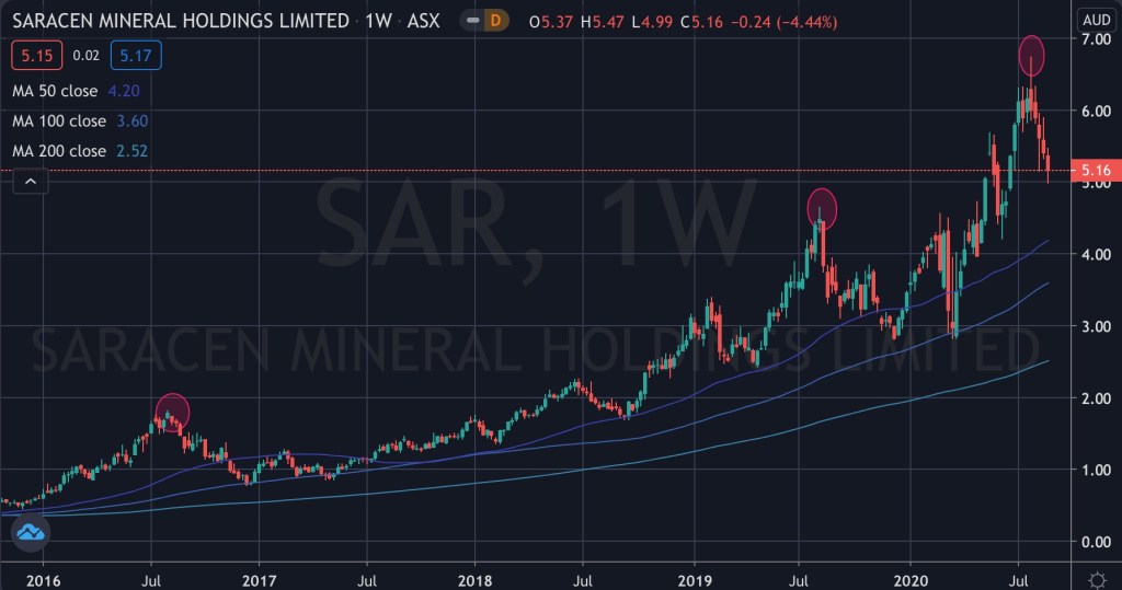
The attached chart shows Saracen (SAR:ASX) over a near 5 year period on a weekly basis,
On three occasions (denoted by the highlighted circles in the chart below), the stock was trading at a price resembling 3 times higher than its 200 day moving average.
On each time, the stock reverted to visit its 50 day moving average and eventually kissed its 100 day moving average.
September 3, 2020
by Rob Zdravevski
rob@karriasset.com.au