Could it be a new equities bull market?
February 17, 2023 Leave a comment
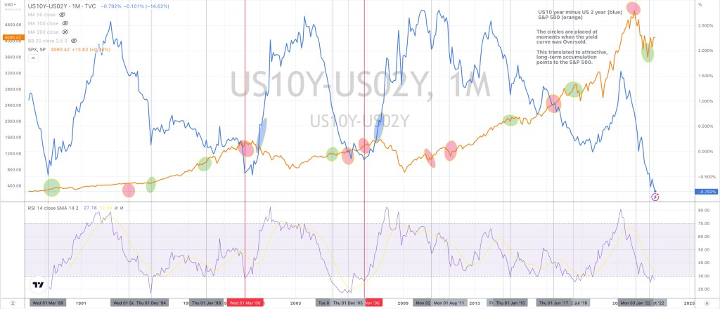
My queue in the chart below are the green circles, when the U.S. inverted yield curve is Oversold on a Monthly basis.
This study suggests a new advance or extension in the price of the S&P 500 Index (orange) is underway where the green circles appear.
To counter the bearishness and caution (including mine) along with the growing headwinds that I perceive……the 7th and most recent occurrence over the past 30 years happened in the recent months.
Ignore the pink circles, they relate to the weekly time series but I didn’t want to delete them 😊
February 17, 2023
by Rob Zdravevski
rob@karriasset.com.au
