All is good in the ‘hood’
June 10, 2022 Leave a comment
A year ago, I wrote this note. It has some additional links to read as well.
That note was about watching the relationship between the U.S. yield curve the lows seen in the S&P 500, on a daily basis.
Today’s note highlights a much bigger picture.
It’s a weekly observation over more than 3 decades.
From the ‘page’ of being a constant investor and accumulator and never is one, a seller…..
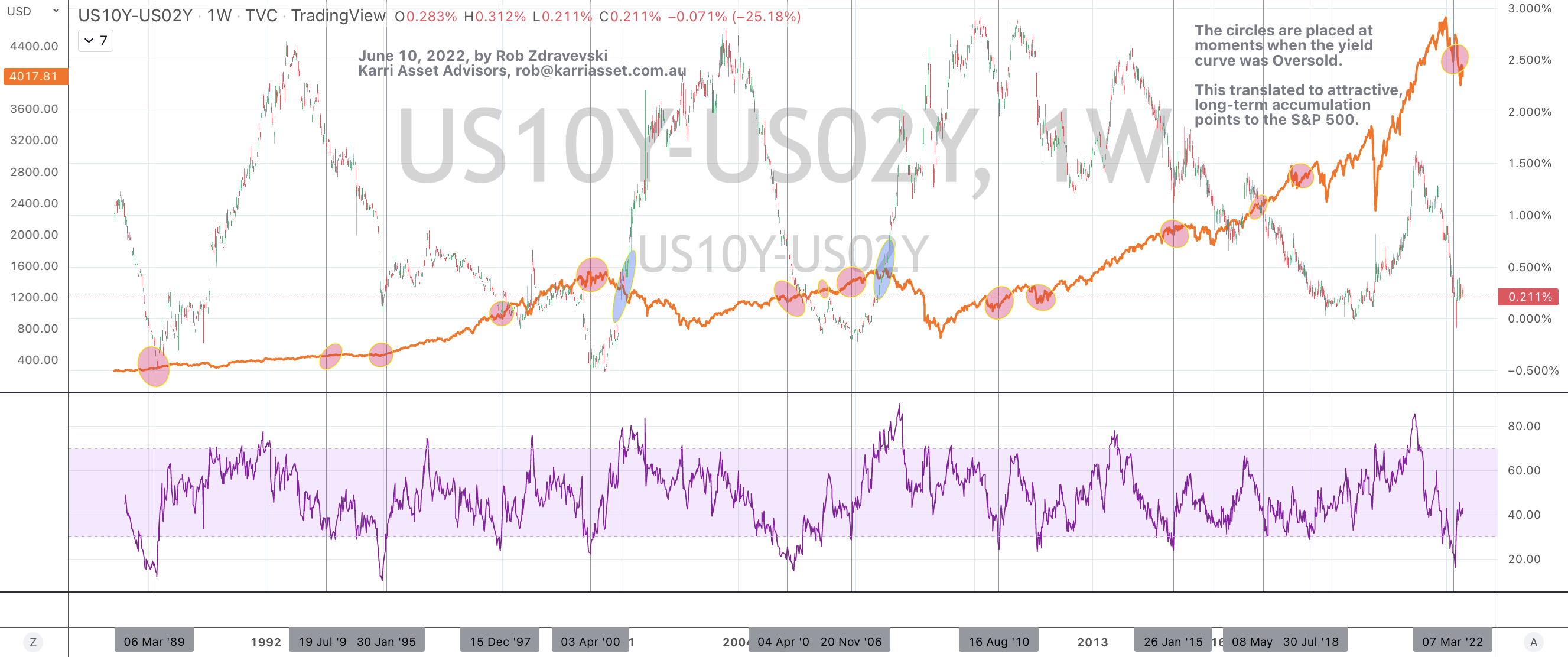
I’d like to direct readers attention to the orange line of the S&P 500 in the attached chart.
The chart requires a little time to stare and digest it.
The circles are placed at moments when the yield curve was Oversold.
It’s not necessarily when the curve was “inverted”.
I have placed vertical lines near as many occurrences without making the lower timeline looking crowded.
For some reference, the yield curve (or spread) is the calculation between the yield of the U.S. government 10 year bond and that of the U.S. government 2 year bond.
This “oversold” moment has happened 14 times in the past 33 years.
This also coincided with attractive, long-term accumulation points in the S&P 500.
The two moments when this thesis failed was when the yield curve notably traded and crossed above the S&P 500, which is highlighted by the blue ellipses.
Today, this scenario is Oversold YET the spread is NO where near crossing ‘above’.
There are no blue circles appearing.
In the context of years, a few months should be insignificant for the longer-term investor.
Today’s message happens to match last months musing’s about the lows in the S&P 500 and Nasdaq…..
and the Buy signals in my recent newsletter….
https://mailchi.mp/karriasset/buy-signals-appearing
June 10, 2022
by Rob Zdravevski
rob@karriasset.com.au