JP Morgan then and since
January 21, 2022 Leave a comment
Nearly 10 years ago, (in May 2012) I wrote a post (link below) correlating an overreaction in the fall in JP Morgan’s stock price to being similar to that of BP’s decline following an oil rig explosion.
https://robzdravevski.com/2012/05/16/anatomy-of-an-overreaction/
It’s timely to re-visit the anatomy of overreactions as investors are experiencing a new downdraft in stock prices and putting it into perspective when considering a longer investing horizon.
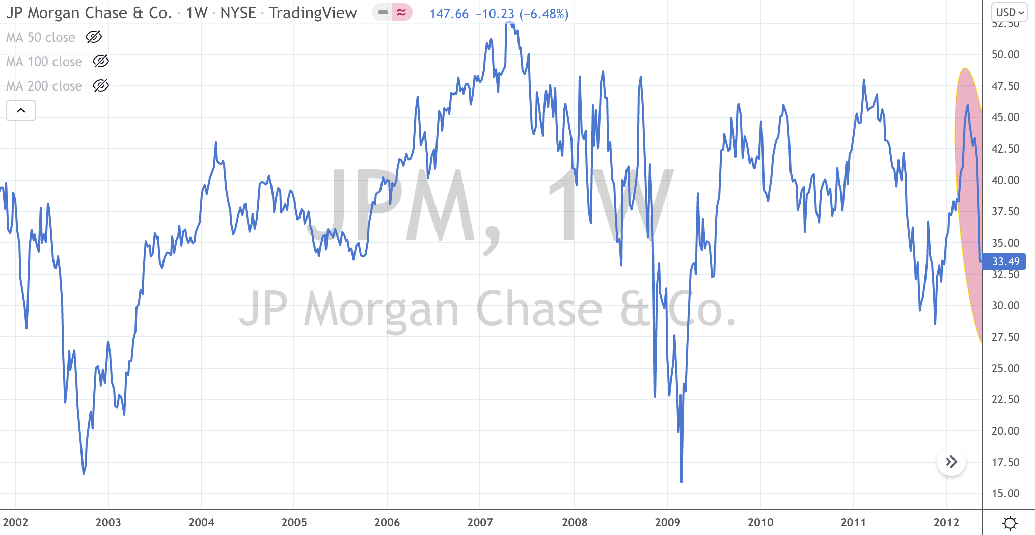
This first chart below shows JP Morgan’s stock performance up to those weeks in May 2012, JP Morgan stock fell 25% (from $44 to $33). It was quite an event to see a major financial institution lose a quarter of its market capitalisation in such quick order.
The stock price is no stranger to volatility but I do think volatility is the price an investor pays for longer term capital gains.
So, there you see a chart where JPM was trading at the same price it was 10 years earlier, with many of peaks and troughs.
Sympathetically, the S&P 500 also paints the same picture between 2002 and 2012.
The next chart shows JP Morgan’s stock price since then.
The result has been a 500% rise with plenty of dips along the way.
A Warren Buffet quote comes to mind, ‘Only buy something that you’d be perfectly happy to hold if the market shut down for 10 years’.
And there lies a reminder that just because a company’s stock price is listed each day, one should be measured when making their next decision.

January 21, 2022
by Rob Zdravevski
rob@karriasset.com.au
