Where is the pendulum
October 12, 2021 Leave a comment
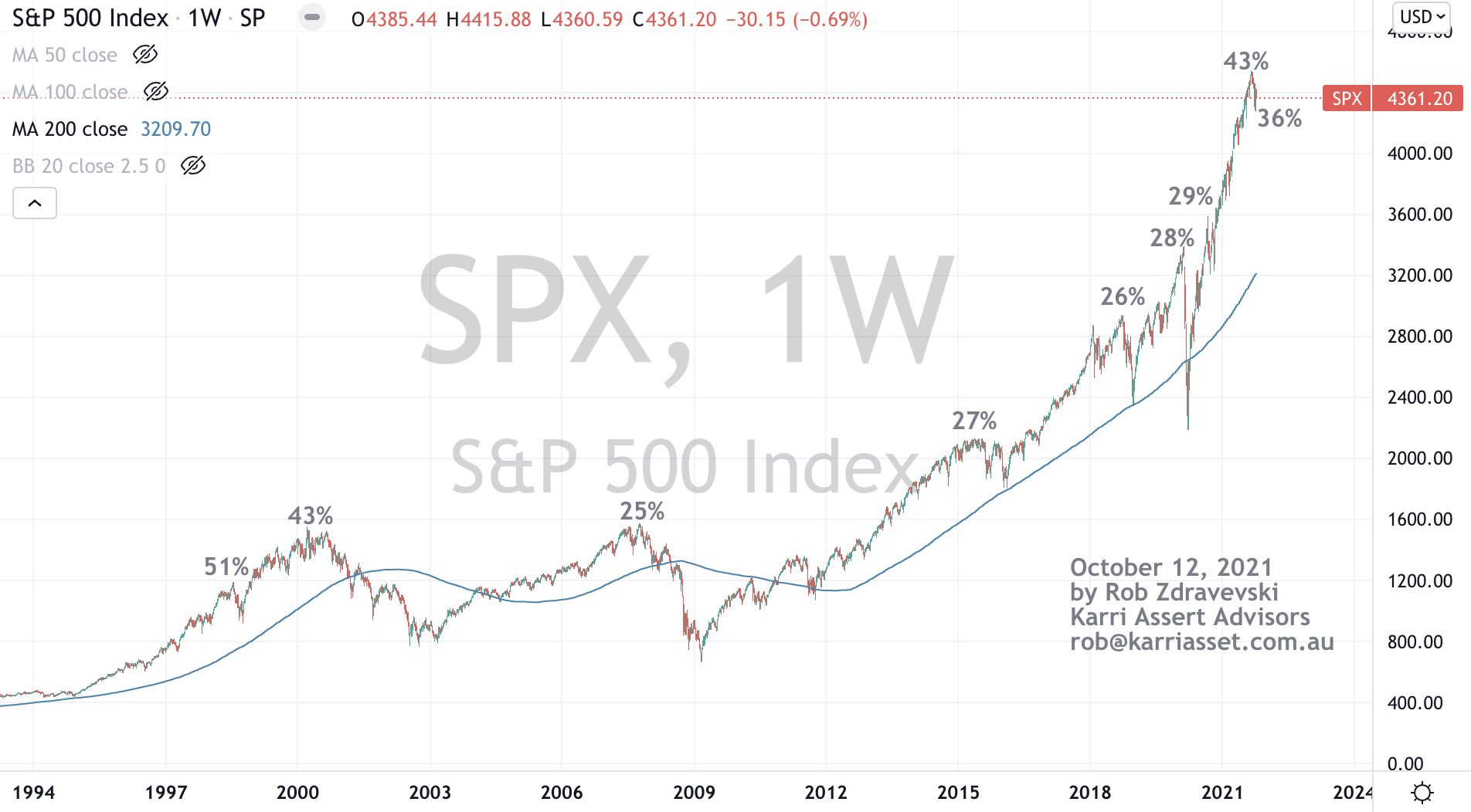
Here is a weekly chart of the S&P 500 over a period of 28 years.
My notations show the extreme percentages that the SPX was trading above its 200 week moving average. It was 43% a couple weeks ago and is at a relatively high 36% today.
I’m trying to show where we are in the ebbs and flow of price movements and not chasing something at the highest point of the pendulum’s arc.
October 12, 2021
by Rob Zdravevski
rob@karriasset.com.au
#spx #probability